This guide, written by Sebastien Gabriel, is designed as a « get started » or introductory read for the starting to intermediate designer who wants to learn or get more knowledge about cross-DPI and cross-platform design from the very beginning. No complex math and un-parsable graph, just straight forward explanations ordered in short sections for you to understand and apply directly to your design process.
What is DPI and PPI
DPI or Dots Per Inch is a measure of spatial dot density initially used in print. It’s the number of ink drops your printer can put in an inch . A smaller DPI yields a less-detailed image.
This concept is applied to computer screens under the name PPI for Pixels Per Inch. Same principle: It counts the number of pixels your screen can display per inch. The name DPI is also used in screens.
Windows computers have a default PPI of 96. Mac uses 72, although this value hasn’t been accurate since the 80’s. Regular, non-retina desktops (mac included) will have a PPI of 72 minimum up to around 120 maximum. Designing with a PPI between 72 and 120 ensures your work is going to be roughly the same size ratio everywhere.
Here’s an applied example:
A Mac Cinema Display 27” has a PPI of 109, which means that it displays 109 pixels per inch of screen. The width with bevel is 25.7 inches (65cm). The width of the actual screen is approximately 23.5 inches so 23.5*109~2560, which makes the native screen resolution 2560x1440px.
Screen resolution (and native resolution)
Screen resolution can have a huge impact on how the user perceives your design. Thankfully, since LCD monitors have replaced CRT ones, users now tend to have native screen resolutions that guarantee a good screen size/PPI ratio.
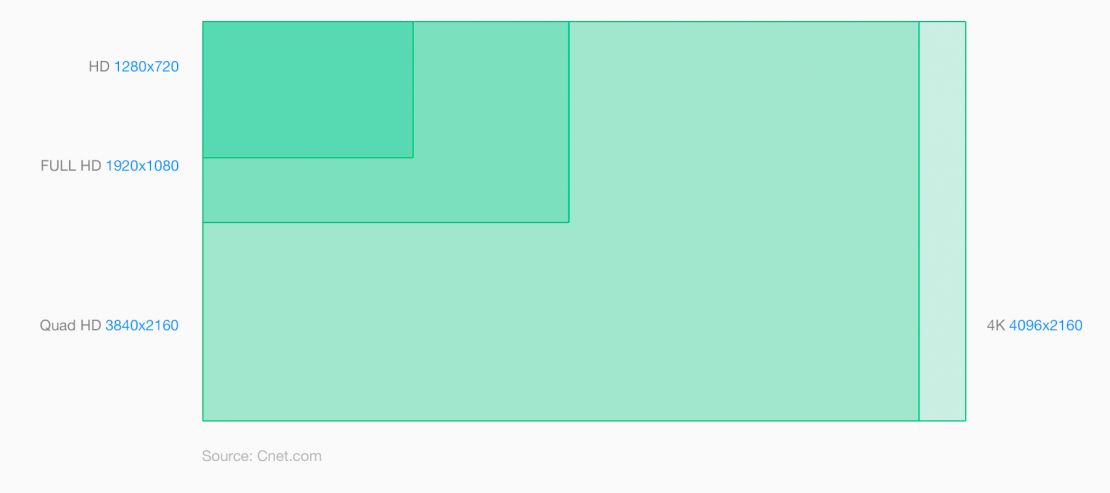
The resolution defines the number of pixels displayed on the screen (ex: 2560*1440px for the cinema display 27in.) 2560 is the width, 1440 is the height. Of course now that you know what PPI means, you understand that this can’t be an unit of measure of a physical size. You can have a 2560×1440 screen the size of your wall and another one the size of your head.
Today’s LCD monitors have a pre-defined default or native resolution that will handle the exact number of pixels that the screen is able to display. It was slightly different with old CRT monitors, but since those can be considered dead, let’s not enter into the details (and not reveal my only partial understanding of the good old TV).
Let’s take our 27” Cinema Display that can display 109 PPI at a native resolution of 2560*1440px. If you reduce the resolution, the elements will appear bigger. After all you’ll have 23.5 horizontal inches to fill with virtually less pixels.
What is a retina display
The naming of “Retina display” was introduced by Apple for the iPhone 4 release. It’s called Retina because the PPI of the device was so high that the human’s retina was supposedly not able to distinguish the pixels on the screens.
This statement is true for the range of devices’ screen size it’s used in, but as the screens are getting better and better, our eyes are now trained enough to perceive the pixels – especially for rounded UI elements.
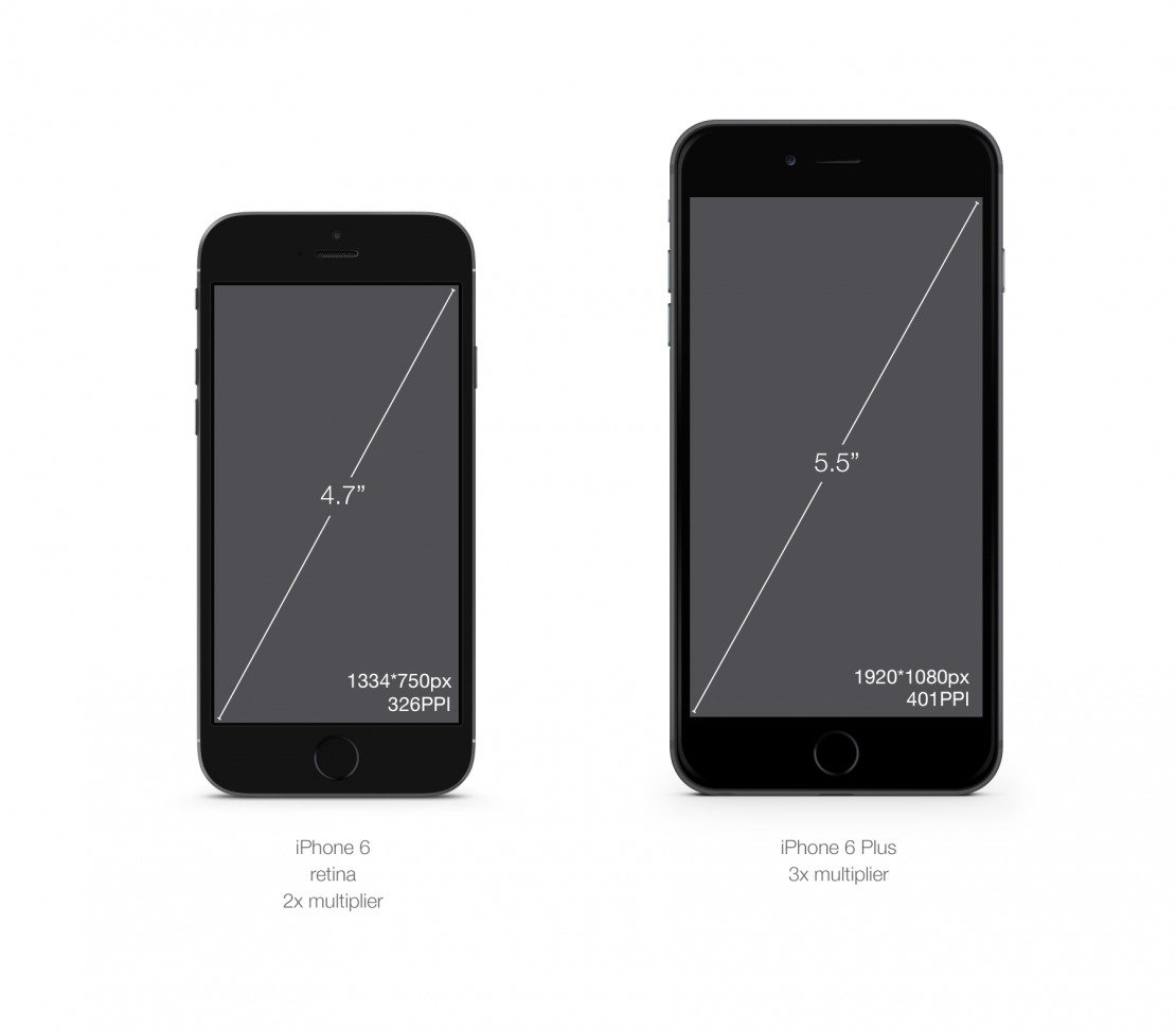
Technically, What they did is display twice as many pixels in height and width in the exact same physical size.


combien est la taille approprie d une image retina qui as pensée pour s’afficher sur le web,
ça ne devrait de passer de combien de KBs?
merci ˆˆ
Bonjour, votre question est un peu étrange… La taille ‘appropriée’ dépend sans doute de la capacité de nos écrans (variable), et de nos yeux (pas mieux) à percevoir la différence entre deux images ayant des densités de pixels et des taux de compressions différents (chromie, artefacts…). De plus il s’agit, à mon sens, plus de choix stratégiques et ergonomiques liés à la fonction et à l’importance de chacun de ces médias en fonction de leurs roles que de règles absolues à appliquer… Enfin, un site web ou une application ne sont pas que l’ajout de médias bout à bout. Il… Lire la suite »
http://www.creativejuiz.fr/blog/veille-technologique/css-retina-hd-webkit-image-set-picture-srcset
http://www.lesintegristes.net/2011/05/06/web-resolution-72dpi/
http://wdfriday.com/blog/2012/06/adapter-vos-sites-pour-les-ecrans-retina/
http://simurai.com/blog/2012/03/25/icon-sharpness-limbo/
http://wdfriday.com/blog/2012/06/adapter-vos-sites-pour-les-ecrans-retina/
http://www.teehanlax.com/blog/density-converter/
« Let’s use a tablet with a 4:3 ratio as an example. I set up a blank PSD @1x (which is 1024 × 768 pixels) and another @2x (2048 × 1536) and a third @3x (3072 × 2304). I then did some comparisons. »
http://www.smashingmagazine.com/2015/05/retina-design-in-photoshop/