Very good article, from Gonçalo Veiga, for Medium
10 Rules for Creating a Mobile Look and Feel
Mobile is all the rage these days. Having a world of knowledge in our pockets has become a commodity, and we’ve grown accustomed to certain standards. Developers need to understand how to meet the lofty expectations of a world where something like 60 frames per second can be the difference between a huge success or a major disaster.
How can you go about creating apps that meet those higher-than-ever expectations?
If something that happens in a blink of an eye can have this kind of impact on an app’s success, you can certainly imagine that a life as a mobile developer isn’t an easy one.
This is particularly true if the right tools aren’t being used — tools that enable you to focus on what’s really hard while they do the easy part. If you’re the one doing the web-to-mobile transition, you’re bound to enter a world of contradiction and paradoxes: when you go small, you actually have to go big.
To give you a hand we came up with a set of rules — or just call them guidelines, if you will. Here are 5 rules for getting “the Look” and 5 rules for achieving “the Feel.”
5 Rules for Getting “the Look”
Apple set new, amazing standards for what a mobile experience should be. It offered guidelines, sample apps, and inaugurated the era of the high scrutiny approval process — a far cry from what the mobile app landscape was up until then.
Eventually, Google also had to start raising the bar in terms of scrutiny, and proposed a few guidelines of their own with Material Design, for instance.
Apple’s defaults redefined what users expect to see and and feel when using a mobile device. In this case, the trailblazers were also de facto trendsetters. You can tackle the “see” part with these guidelines.
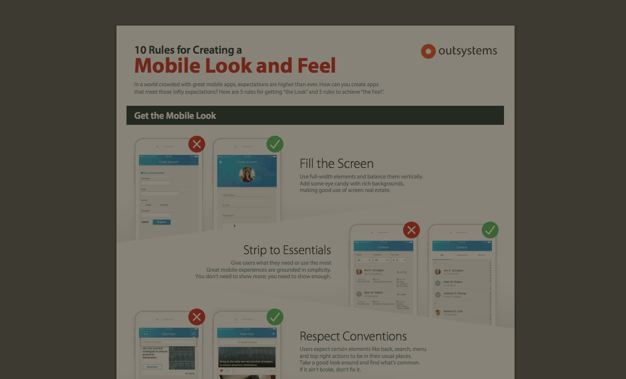
#1 Fill the Screen

People love visuals, so you shouldn’t stint on them. Your mobile screen is a canvas and you’re a painter. Use full-width elements and balance them vertically. Add some eye candy with rich backgrounds. Make good use of screen real estate.
#2 Strip to Essentials

Nobody likes clutter, and in a small space like a mobile screen, clutter can be magnified. So, it’s important to give users what they need or use the most. Great mobile experiences are grounded in simplicity, so you don’t need to show more; you need to show enough.
#3 Respect Conventions

Conventions came to be for a reason. With mobile, users expect certain elements like back, search, menu and top right actions to be in specific places. So, take a good look around to find what’s common and remember: if it ain’t broke, don’t fix it.
#4 Be Pixel Perfect

Thanks to LED, HD, retina displays and users who factor emotional response to visuals into their decision-making, “gorgeous” is the name of the interface game. Make sure your alignment and spacing are perfect. Use high quality images that scale well on all screens. Don’t mix several different fonts, sizes and colors.
#5 Step Away from the Web

The web ruled for so long that it’s hard to let go of it and put yourself in a native mobile mindset. In addition, some web features can also exist on mobile even though they probably shouldn’t. You might be tempted to grab one of the millions of available plugins, but you should exercise caution as you survey the plugin scene. For example, don’t do underlined links, pop-ups, or radio buttons. These were not designed for a mobile experience.
5 Rules for Achieving the Mobile Feel
Some things are just universal in this brave new mobile world, and feel is most definitely one of them. Again, we have Apple to thank for user expectations around feel and touch. So, here are some tips for delighting them.
#1 Think Touch

Mobile is tactile, and the finger rules. So, for mobile, you should provide larger buttons and hit targets, make cards fully touchable and provide instant reactions. Remember: there is no hover effect on mobile. And never forget: the mouse and the finger are not “as one” in the mobile universe (mouse != finger).
#2 Slide and Stretch

In native mobile, screen interactions are awesome, so use their interactions to their fullest. Pull to refresh, and have the header hide on scroll. Make it easy to scroll in any direction. Gestures are expected for touch interfaces, so, zoom, stretch, pinch.
#3 Fine-tune Transitions
In real estate, it’s location, location, location, but in mobile, it’s transition, transition, transition. Not only do users want them fast, but they want them to “feel” fast. Ease screens into visibility as if they were already there and use graceful right to left sliding to open detail screens. Slide from bottom to top to open creation screens. Reverse transitions when going back.
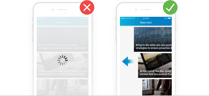
#4 Graceful Loading

For native mobile users, speed, transition and performance are everything. Nothing strikes fear in their hearts faster than a blank screen. So, make sure you don’t start from one. Show something before all data is available; don’t wait. Load progressively instead of bulk loading all data to make elements appear gracefully. Content should not jump around.
#5 Add Movement

Elements do not just appear out of nowhere in the real world — unless it’s magic. Native mobile users like to see things move around. You might not be able to use magic, but you can create an illusion. So, use animations to ease in content and also to collect any required data.
Guess What? You Don’t Have to Memorize These Rules
You can download this two-sided cheat-sheet as reference for whenever you think your application doesn’t look or feel right.

By the way, remember that we mentioned some things can be easy so you can focus on the hard ones? Give OutSystems 10 a try. (The personal edition is free, forever.)
Not only does it come with an incredible framework — Silk UI — that’s grounded in all these rules by default, but it can also help shorten development time so much that you can focus on what’s really important and hard — like meeting those user expectations.