Designing for iOS 7
- Deference. The UI helps users understand and interact with the content, but never competes with it.
- Clarity. Text is legible at every size, icons are precise and lucid, adornments are subtle and appropriate, and a sharpened focus on functionality motivates the design.
- Depth. Visual layers and realistic motion impart vitality and heighten users’ delight and understanding.
Whether you’re redesigning an existing app or creating a new one, consider approaching the job in the way that Apple approached the redesign of the built-in apps:
First, strip away the UI to expose the app’s core functionality and reaffirm its relevance.
Next, use the themes of iOS 7 to inform the design of the UI and the user experience. Restore details and embellishments with care and never gratuitously.
Throughout, be prepared to defy precedent, question assumptions, and let a focus on content and functionality motivate every design decision.
Sommaire
[wt-row][wt-column width=’one-half’]UI Design Basics
- Designing for iOS 7
- iOS App Anatomy
- Starting and Stopping
- Layout
- Navigation
- Modal Contexts
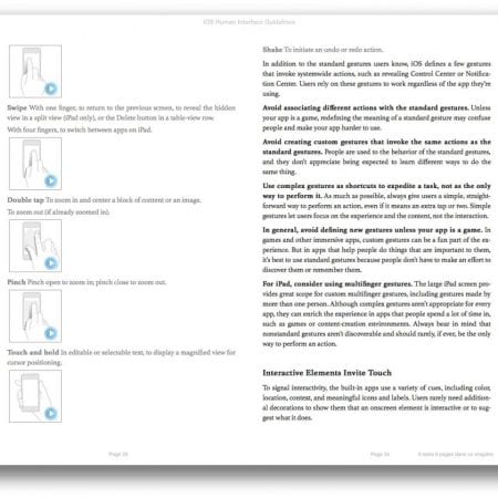
- Interactivity and Feedback
- Animation
- Branding
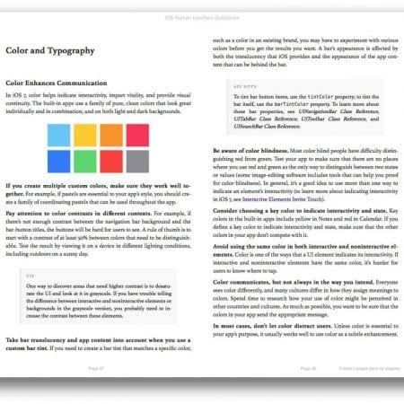
- Color and Typography
- Icons and Graphics
- Terminology and Wording
- Integrating with iOS
Design Strategies
- Design Principles
- From Concept to Product
- Case Study: From Desktop to iOS
- Running on iPhone 5
UI Elements
- Bars
- Content Views
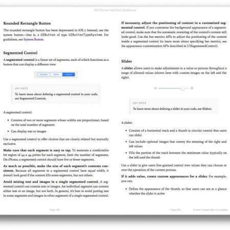
- Controls
- Temporary Views
iOS Technologies
- Passbook
- Multitasking
- Routing
- Social Media
- iCloud
- In-App Purchase
- Game Center
- Notification Center
- iAd Rich Media Ads
- AirPrint
- Accessing User Data
- Quick Look
- Sound
- VoiceOver
- Edit Menu
- Undo and Redo
- Keyboards and Input Views
Icon and Image Design
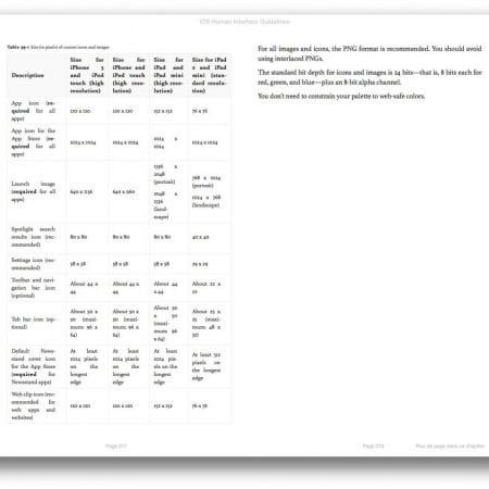
- Icon and Image Sizes
- App Icon
- Launch Images
- Bar Button Icons
- Newsstand Icons
- Web Clip Icons
- Creating Resizable Images
